
Lists don’t always have to be linear and boring. In this post we’ll see how to add some extra depth to a horizontal list by adding a simple parallax effect.
The base for the example will be a RecyclerView, configured with a horizontal LinearLayoutManager, and we’ll be using a ScrollListener to create the parallax effect.
Example code:
All code from the example below can be found at my Github page, and the demo app is available for download here: APK@Github
Set up the RecyclerView
First, we need a data class to represent the list items. We can represent a TV show with a simple model class, containing a title, description and an image:
Second, we need a list adapter for Show items. Nothing fancy here, the adapter delegates the view binding to the ViewHolder:
Now let’s configure our RecyclerView:
The first two lines are basic — we create and add an adapter and make the list horizontal.
At the third line, we attach a PagerSnapHelper to the RecyclerView. The PagerSnapHelper is part of the RecyclerView library and makes the list behave like a ViewPager, where one view is always snapped to the center of the screen. So if you scroll halfway between two views and let go, the list will automatically center the closest view.
The last row calls setupParallaxScrollListener(), a function that configures the parallax effect. However, for it to make sense, we first need a list item…
Create a ViewHolder
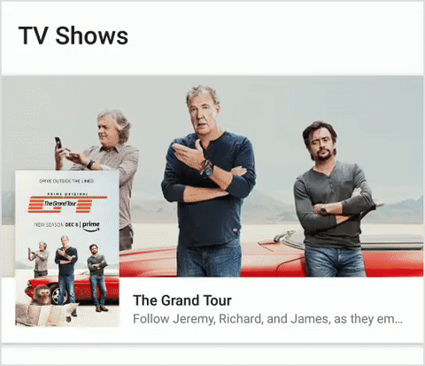
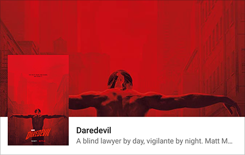
This image shows what the item view will look like. We have a title and description text, and we show the Show image as both a thumbnail and the background.
 To create the item, we define
 item_show.xml as below. Note that most of the styling has been removed for brevity (the full implementation can be found here).
(For the full layout, see item_show.xml in the Github repository.)
With the layout done, we need a ViewHolder for the RecyclerView. Most of the implementation is pretty basic: we take in a Show item and bind the text and image to the view. We also add an extra property called offset, which is responsible for adding the parallax effect.
Let’s step through the offset setter:
field = v.coerceIn(-1f, 1f)
The offset is relative to the view width, and needs to be limited to the range of [-1.0..1.0] or else the views will be moved too far off the screen.
val direction = if (field < 0) -1f else 1f
The offset sign determines which direction the views will move in. A value less than 0 means that the views will move to the left, and a value greater will move to the right.
interpolator.getInterpolation(abs(field))
Here we define how the parallax views should be moved. To understand what this does, we first need to understand what an interpolator is. An interpolator is simply a function that takes an input value and transforms it into another value. In the animation below there’s the red ball, which is a linear function, and the purple ball which is an easing function.
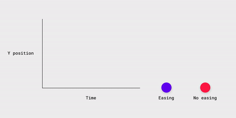 Credit: Material Design Guidelines, Motion chapter.
As you can see, they start and end in the same place, but the path in between is different. When a user scroll a view with its finger, the view moves as a linear function (red ball), which means that the view will follow the user’s finger. Adding a parallax effect means that you want some of the views to deviate from the finger position and move at another pace, but end up in the same place as the rest of the views. To achieve this, you can transform the linear scroll input by passing it to an easing function and apply the result to some of the views, making them move like the purple ball, while the rest of the views move like the red one.

The reason for sending abs(field) to the interpolator is that it expects a value between 0 and 1, and will cap any negative value to 0. So we remove the sign of the input and re-apply it as a direction later on.
direction * interpolatedValue * itemView.measuredWidth
Let’s break it down:
- direction - Determines if the view will move to the left or right.
- interpolatedValue - A value in the range [0.0..1.0] that determines how far the view should be moved, relative to the item view’s width.
- itemView.measuredWidth - The width of the item root view.
Now, the only part left is to apply the new translation to the views that should move at a different pace. This is done by changing the translationX properties for the title, description and thumbnail.
The ParallaxScrollListener
Here’s the meat and potatoes of the parallax effect: let’s first have a look at the code and then step through it.
The code is based on the fact that our list item is as wide as the RecyclerView. This means that there will be (at most) two visible items at the screen at any given time.
Here’s what’s happening:
- Get the RecyclerView scroll offset, i.e. the total number of pixels that it’s scrolled from its start position.
- Next we want to calculate an offset factor between [0.0..1.0], indicating how far the current item view has been scrolled (0.0 being not scrolled at all and 1.0 being entirely off screen). To do this we take the scroll offset and use the modulo operator to get the remainder, which in this case represent how many pixels the current view is scrolled. To get the fraction we then just have to divide the remainder with the width of the RecyclerView.
- Find the first visible ViewHolder in the LayoutManager and apply the offset to the ShowViewHolder.
- Find the last visible ViewHolder in the same way, however, for this case we need to add an extra check. There are two items on the screen while scrolling, however, if the view is snapped to the center,
findFirstandfindLastwill find the same item, causing the offset to be updated twice. To prevent this, just check that the position of the first and last item differ before updating the offset.
And that’s all there is to it. You now have a list with a fancy parallax effect.
Wrapping up
So there you have it, the basics for adding some spice to a simple list. Remember, this is just one example of what you can do. To further customize the transition, use the offset provided in this example and play around with other view properties like:
- Translation X,Y,Z
- Scale X,Y
- Alpha
- Tint color (tip: use ArgbEvaluator to tween colors)
That’s all for this time, have a good one!
Patrick Elmquist is an Android/iOS Developer at Knowit Mobile. He's a caffeinated unicorn of excellence, with an interest in UX and design.
This post was originally published by Patrick on Medium.


